0 Comments

I am delighted to have recently had several of my works published in the University of Texas at Dallas annual arts journal, Reunion: The Dallas Review. My work was chosen for the front and back cover as well as an inside feature.

For over two decades, Reunion: The Dallas Review has been dedicated to finding and publishing exceptional examples of short fiction, drama, visual art, poetry, translation work, non-fiction, and interviews. Their mission is to cultivate the arts community in Dallas, Texas, and promote the work of talented writers and artists both locally and internationally.

The School of Arts & Humanities, the home of Creative Writing at the University of Texas at Dallas, is not your conventional university department; they are a forward-thinking, interdisciplinary unit that offers degrees that cross the normal boundaries between art and science, language and literature, technology and philosophy.

For more information and how to purchase the journal please visit: www.utdallas.edu/ah/reunion


0 Comments

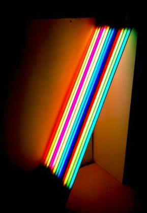
I have recently had my work published in a new book exploring perceptions of the city on a global scale. ‘An Additive Mixture #2’ was chosen to be printed in this zingy book which was published to coincide with an exhibition of the same name at Hanover Project, UCLAN, Preston.

Artists were invited to reflect current cultural, social and political subjects through engagements with the built environment in which they live and / or work. The exhibition and book is the result of an open call for submissions, and works have been received from artists working in Ireland, Sweden, UK, Portugal, Lithuania, Denmark, Italy, Sweden, USA, Austria, Israel, Romania, Germany, and Qatar. The book and exhibition were curated by Victoria Lucas.


0 Comments

On one of my previous blog posts I spoke about how I have used materials from old work to make new work. This week I am still playing with the 6 LED Light Sheets sourced from my old work Repeated Everyday.

In the past couple of days I have been layering coloured acetate’s on top of the light sheets to make new light drawings (images here). I have been excited about the results and think that the use of transparencies works well within my practice and within my research into luminosity.

Today I decided to use the notion of reusing elements within old works to use within new experiments. I pulled open my plan-chest draw to find 10’s of works on paper that I had made last year as part of my Arts Council England Grants for the Arts Research and Development funding which I was awarded.

There were some works that I never showed as they didn’t quite work. They didn’t work because the colours were too flat or sordid or there wasn’t enough white space around the image; basically the image I had created didn’t jump off the page, like the successful ones did.

I felt this was a shame, but didn’t bin them. I don’t keep everything, but I kept these sheets. There was elements within them that I liked, but they weren’t 100%. Now I know why…

They totally lacked luminous colour!

I was attempting to use bright hues, but the colours didn’t sing.

One by one, I laid the works on paper onto my LED light sheets and photographed them. I felt a sense of excitement when a few of them started taking on a new lease of life. The light source offered the colours a voice: they were singing!

The colours were at last, vivid in their hue, saturate and glowing; they has become luminous. Of course not all pieces did this; especially the ones where I had applied colour on top of black or collage. The blackness blocked any saturation the colour could muster altogether.

In some of the more successful ones, shown below, the use of the black separates the colour, as a line in a drawing or a wall within a space. I believe that this is how these works should be shown. I feel they are finished.

Such a simple change makes all the difference. Lifting them from out of my draws, out of their dullness, and into becoming possibilities. I see all my works on paper as possibilities: potential for how they could be taken into three dimensions and how they might one day occupy space.


0 Comments

I have been continuing my experiments with coloured theatre gels and the LED light sheets I recovered from an old work earlier last week. I have been mainly just playing in my studio; arranging then rearranging the coloured acetate filters onto the LED light sheets, both as they come as by cutting them into my desired shapes.

This playful approach very much reminds me of the Construction Project that I set myself earlier in the year; making, documenting and taking apart whatever work I made. I have been using my iphone as a way of documenting my stream of ideas very quickly. I do not want the photographs of the ideas to be polished, as the ideas themselves aren’t yet; they are still developing.

Visual research.

As I try and bring reading back into my practice as a method of learning, I have also tried researching my concerns through doing and making; I find a combination of both suits me well (an obvious thing to say and do, but I’m still learning).

In the past, I have felt unable to be as playful, thinking that everything I made had to be polished and therefore a finished work. I was wrong. This method of practice has proved unhealthy as I found myself churning out commissions without allowing myself time to develop as an artist.

This set of images shows how I have used the coloured gel filters in three dimensions rather than laying them flat over the light sheets, laminating them or overlaying them on top of each other to create different levels of saturation within the colour scale.

I have still managed to achieve the increasing saturation through the building of layers, but with these images, I have thought more about how I could create this within three dimensional space. These small acetate experiments are positioned on top of and in front of two of my LED light sheets to make the colour luminescent.

I envisage these meager tests works to potentially exist within large spaces, maybe in front of opaque windows (natural light turning the colour transparencies luminous) or another light source. I can imagine them scaled up to mammoth proportions, as to impact on a space. Giving the viewer a chance to stand amongst the sculptures, becoming part of the coloured layers. Or allowing a viewer to gaze at the intertwining layers that create stronger colour saturation as the scrolls roll tighter. Another thought: Placing them on a LED light sheet shelf (keeping with the small scale) to allow people to come up, close and personal.

There is so much potential here. So much to play with…

When I was at The Glasgow School of Art, Ross Sinclair gave a lecture about the importance of documenting everything you did. He was right. Whatever I decide to do in the long run, at least I have snapped away and got them in my iphone photo library –  my digital sketchbook.


0 Comments

I got back in the studio last week after a busy period including my Merz Barn residency and a number of exciting commissions.

I started the week by dismantling an old piece of work in order to retrieve some custom-made LED Light Sheets that had been fabricated for me over 3 years ago to fit inside a miniature chamber piece commissioned by Manchester’s Blank Media Collective  for their Arts Council Funded ‘Inside’ exhibition.

As some of you already may know, I often use elements from my past works and build them into current pieces. An example of this can be seen with my sticklights that I had commissioned using my Arts Council England funding award last year. I have used them in several works since, included the work that they were initially made for;

Tempo, September 2013, In solo exhibition On Brown & Violet Grounds, Piccadilly Place Manchester


An Additive Mixture #1, October 2013, Bury Light Night


An Additive Mixture #2, November 2013, In group exhibition Synthesis, Victoria Warehouse Manchester


An Additive Mixture #3, March 2014, Solo exhibition, Exeter Phoenix


Beyond Space, August 2014, Commission for Kendal Calling Festival


I know it is cheeky to use and re-use materials, but when there is very little funding available for each project then needs must. With each/any dollop of funding I buy a new stock pile of exciting lighting equipment, this then see’s me through a period of creative endeavors.

I’m digressing.

So, I now have a set of 6 LED Light Sheets, which are an incredibly well-made, even light source that I can use within my current practice. They are made up of an LED matrix that stretches across the whole sheet of polished acrylic. They are, in all effect; a small, very flat, spectacularly neat, light box. Even though I have had them in my life for over 3 years, they have served their initial purpose and been hidden away within my old Chamber work and therefore seem like a brand new toy now.

I began by layering sheets of cut theatre gels onto the light-box surface. I started my making multicoloured laminated collages, which then quickly transformed into single or dual coloured overlays. What is interesting about them for me, is how different shades and tones of a colour can be built up using these transparencies.

These examples are using just two colours in each: yellow and amber, green and pale blue, peach and red. They are laminated in A4 100g pouches and laid over the light source for documentation. More to follow…


0 Comments