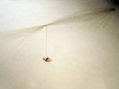
A Saturday spent sweating over which images/exhibitions/ collaborations to use for a new website.
I am a serial over- blinger…tend to talk too much, write too much.. so too many images is definitely where I will go unless tightly reined in.
Having said that strangely what I would like is a minamalist website, but I still feel the need to explain the work – which is mostly installations.
Do I have to add materials to the screen as well?
Installations are site specific, so the images look very different. Lucky the artist whose work is so similar it automatically makes a whole.
I had no idea it would be so time consuming – first find your template. Why are all the minamalist ones I like non – responsive [ie not so good on iPhones and iPads?]
Then delete from your list images you love but are too old/ no longer relevant to your work/ not a high enough calibre exhibition/etc /etc…
Next spend an excruciating morning re-writing your statement…who is this website for? Art speak or no art speak? Does warmth and ease of comprehension equal non professionalism?
Try and fail to find live links to interesting interviews you did and catalogues.
One friend reckons no one out there is interested in anything other than your recent work and your CV. Possibly right but installation work doesn’t have the same obvious ‘history’ as a body of work in another medium does.
So – a chance to go back over ones work so far.
A chance to draw a line and re-start maybe……….now to learn how to make a website tomorrow..

