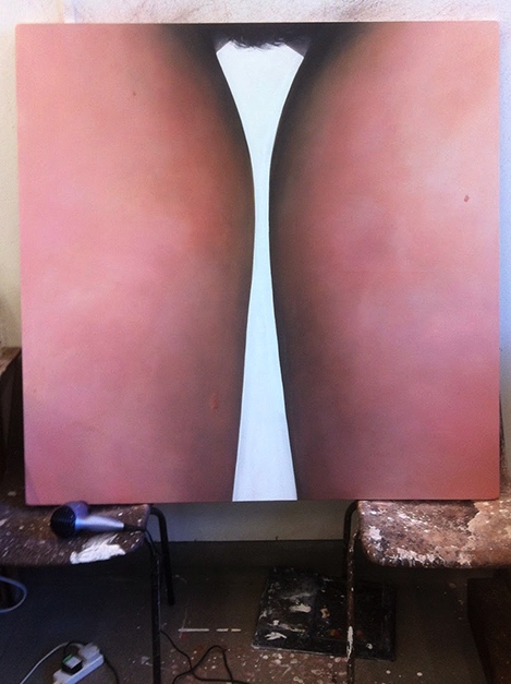
Below is an idea I decided on as a take on the work Table, 1969 by Allen Jones.
Initially I had intended to start by setting the image against a very plain background in order to centralise the focus on the ‘table’. I had in mind the possibility of going on to create an office-like setting as a progression of the idea, in order to emphasise the point in the Dworkin quote that, despite being in positions of power, in business for example, nothing has really changed in the ways that people view woman’s roles in society. I wanted the emphasis to be on the fact that misogyny is still so ingrained in our society that it wouldn’t be surprising for people to be blasé about the idea of a woman (supposedly more powerful in this day and age) being reduced to an object of servitude.
Notebook Pages, Project Layout Ideas
Untitled, 2014
When reflecting on the success of this image, it feels somehow cluttered, too busy with too many things detracting from the main element that should be the table structure. I am now wondering whether going back a step and experimenting with my initial idea of keeping the imagery very simple, might make for a more powerful end result.
Next steps:
Strip back the scene to perhaps a white background (whitespace)
Re-take the image in this plainer setting
Add in a sheepskin rug as used by Jones in his original sculpture.
Would the plain background and hence a clearer, simpler reference to Jones’s work give it more impact?

