2 Comments

Following my 1-1 with Jane today, 26/05/21, we discussed the fact I must acknowledge the critique of my work. It is very controversial I have learnt from feedbacks and it is a sensitive topic of female control.

As I have directed the male to put and bite down on the breast in his mouth is strong thought. It is interesting to mention from this talk with Jane that if this was a males instruction/direction, the outcome of the film would be completely different and be clearly sexualising and glamorising the control/destruction of the female form done by a male, instructed by a male. So, with this idea of a female instructing a male to do the act, it makes the work feels female dominant in the sense of myself having control over the male in the film and essentially the breast. Providing the viewers an outlook on female consumption through the female gaze, like how the cinema work with a female director, they use situations where they use situations of the male gaze through a female perspective, to allow all audiences to experience its effect. E.g. highlighting a man catcalling women, the director would focus on the impact it has had on the women to exploit it. Like Barbara Kruger’s Your Gaze Hits the Side of My Face and like how I have done with my current films, making it feel female empowered, as I am exploiting the consumption of a female (breast) through a male, showing the issues with male control/dominance.

Reflection 26/05/21: Like Laura Mulvey within her famous essay Visual Pleasure and Narrative Cinema, she explores and states the impact the male gaze has upon the cinema and women through a female perspective. It was the early years of this being brought to light/listened too where we began to see change as women so it was very controversial. I feel like I am like this now with my growing practice, I will continue to challenge the male gazes’ impact and dominance upon women as it is still very much an issue.

This lead to me question, does To Bite B&W Repeat also encourage the sexual objectification of women? This is something I have considered but haven’t paid much attention too. Based off of feedback from 1-1s and group crits with my peers/tutors, I learnt that men watching said they felt disgusted/discomfort as they may potentially put them self in the position of the male doing the consumption, where as women watching, feel the consumption and the intensity of the control. So, is it the imagery and act of male control, sexual objectification and destruction that disgust the men? Or is it just this film and that is all? Ultimately, the breast is still being eaten/controlled which ever way you look at it.


And to recap the exploration of my work, I have explored many aspects of the female forms exploration throughout my degree. Last year in level 5 I explored the natural female forms representation and the empowerment it has. I celebrated different body shapes/breast shapes and sizes in reflection to how we both see ourselves as well as each other using mirrors, coloured light in regards to the natural elements of the body. The female gaze and the self gaze was my main focus which had developed from my initial focus on the male. The female gaze approach slowly developed into exploring the ‘grotesque’ towards the end of level 5, and the side of the form we don’t often see/celebrate due to our online presences. We chose to show our best side of ourselves which then confuses ourself and each other with whether that is real or not.

Growing into level 6, I aimed to take this grotesque element further and to zone into the important areas of the female form. This being the breast as it is the most sexualised part of the female body, due to the male gaze, the media and the cinema. And especially pornography which is something I aim to take further and develop with my sculptural performance. I focused on the breast and accentuating the sexualisation that comes with it (from the male gaze, the media, the cinema and pornography), especially recently within my b&w film of To Bite B&W Repeat, it has explored the flip side/dark side of the female form that naturally follows it = sexual objectification as currently they are the most challenging aspects. The use of a monochrome palette and a dark space for the projection has essentially intensified this view which feels dark, sinister. Upon reflection, this exploration of the darker side to the form was bound to happen as the female form is not all about beauty, it is prominently about the impact that is from the male gaze and the control men have had our the female form for years previously. We as women, are currently getting to a point where we can explore/express our feelings towards this.


I have only touched upon the grotesque/control which is exploiting the sexual objectification and dominance of the female body. There is still whole aspect of pornography to dive into which leads to fetishism of women by Sigmund Freud, which has developed from the castration anxiety. I experimented throughly with controlling the male through performative sculpture and it may be interesting to work with other foods on a large scale, in relation to sexualisation and consumption and to reintroduce the empowerment of women through this format, almost through a new view upon the female form and food? Or will the female form always have a relation/stigma tied to consumption and food which we cannot escape.

Possible materials/foods to work with in the future – fruit, sweets, chocolate? I still really enjoy projection and feel like there is still so much to explore in relation to installation and placement in many space.


0 Comments

Upon reflection from my formative assessment from 07/05/21, Jane mentioned I could explore further into performance as it is a space I aim to continue to develop and work with, especially relation to my sculptural performances.

Valie Export is a visual experimental artist who I tried to touch on back at the beginning of Level 5 but didn’t understand or really enjoy, until now. I decided to revisit as performance is my practice. Export is avant-garde Austrian artist and known “for provocative public performances and expanded cinema work.” (Tate, n.d.). She explores the realism of women that is hidden and glamorised on the screen of the cinema, similar to my artwork which explores the sexualisation of women upon the screen. Her original name was Waltraud Hollinger but chose to change it to break away from the identity attached to her husband and father of the patriarchy. I found this interesting as she wanted to be her own women and have her own control which is reflected in her practice.

I was struck by her two pieces, Action Pants: Genital Panic (1969) and TAP and TOUCH Cinema (1968–71). Action Pants: Genital Panic, see below, was positioned in an experimental film theater, she walked out into the theatre with a live audience, wearing a leather jacket, messy hair and “wearing crotchless pants, putting the seated audience at eye-level with her exposed vagina.” (Chernick, 2017). She is confronting the gaze of the audience and “challenging the public to engage with a “real woman” instead of with images on a screen” (MoMa, 2017). This invites extra gazes which aren’t often present in the cinema film – there is the obvious male gaze (male audience to woman in film) and the female gaze (the possible self comparison/yearn of woman to woman on screen). But Export explores the gaze from herself being present to the audience watching, she has the ability to now look back at everyone gazing at her, to exchange the discomfort/unnatural gaze which women upon the cinema screen often receive without being present. “The artist’s body activates the live context of watching” (MoMa, 2017), “while they are all exposed genitalia at face-level” (Tate, n.d.). It’s really quite concerning to observe the images below, to see this aggression that is present in the messy hair and the leather jacket as well as the crotchless trousers alert this control anger, as well as the fact “she holds the gun at chest level, apparently in readiness to turn it on the viewer towards whom her gaze is directed” (Tate, n.d.). It may have been even more concerning seeing it in person, being in a space with someone who is holding a gun, in front of you with their genital on show. Especially a stigmatised female form which suggests the vulnerability of women. These images are anything but vulnerable.

Reflection 26/05/21: Ana Mendieta uses a similar use of terror/aggression in her Rape series to Export to gain a response and attention, where she is displayed as a victim of rape. The use of the gun from Export completely lowers the aura of the work to a serious level and the vagina on display comes not the problem, like Mendieta.

The use of the gun “defends her female body with the male phallic symbol of the gun. Her self-exposure emphasises her lack of a penis, demonstrating the symbol of power to be a prosthetic and its possession to be a product of role play, positing action over biology.” (Tate, n.d.). It’s this aggression which is shared in my work of To Bite B&W Repeat projected in various spaces. The use of the aggressive large teeth act as a focal point of dominance as it’s something the breast (the female) doesn’t have in the film – the dominance/control. The use of the large projections I create from this film cover the space, make the space feel and those in it feel consumed, much like Export’s work, I could imagine feels like her territory while you’re viewing in the space. With her present in the cinema, could possibly change the entire feeling of the cinema space – on edge.

Valie Export, Action Pants: Genital Panic, 1969.

Export was a very aggressive and confrontal artist, her work exploits the use of the cinemas representation and control of the female form. My works shares this relation to the way she works, by proposing intimate areas of the female form on show, in an unnatural space/situation of female consumption by the male. Action Pants: Genital Panic confronts all problems with the direct gaze from viewer to screen at the cinema which doesn’t explore the reality of the female form.


Export created a following series TAP and TOUCH Cinema, see below, “an experimental screen-free ‘film’ confronting the social, political and sexual positioning of the female body, whilst fracturing the boundaries between cinema and real life.” (Todd, 2016). This performance pieces of her “wearing a wooden box fronted by a curtain on the upper half of her body, Export invited people to reach inside and feel her breasts.” (Tate, n.d.). “Destabilised ideas around pleasure and the sexual value of the female body, where the participant’s reaction and interaction with her body took centre stage in a public sphere” (Todd, 2016). There is this interesting play on the fact you can only watch through a screen of the cinema, but instead here with Export “forced people to encounter in public parts of the female body that they would normally touch or view in a private space or in darkness, where they would not be observed by unknown others” (Tate, n.d.) almost as though she is forcing the viewers/people to come into contact and directly observe what is hidden and shown on the cinema space.

” “My gaze as well as the gazes of the visitors – who were both men and women – were incredibly powerful, extremely powerful and intense.” Reclaiming the female body and the terms by which it was viewed (and felt), EXPORT shamelessly rebelled against the oppressive and submissive images of women that characterised the visual culture of the 60s and 70s.” (Todd, 2016). Becomes an interesting relation to the audience and the work/artists, a connection of bodies and gazes’. Considering both gazes’ is something I am currently evaluating especially in relation to the way Matt and Srin both viewed my artwork as though the breasts being eaten was a watching eye. This introduces this gaze of work to audience.

I have touched on a cinema box with my exhibition proposal exploration – Sweet Box has this similar appeal of having to bend down and viewing a more intimate small space/unusual projections of To Bite B&W Repeat. It almost makes me think that seeing a film projected so small may have more attraction/engagement, the same way Export forces people to not only view her body but to feel the realism that isn’t present within the cinema.

Valie Export, Tap and Touch Cinema, 1968/1989.

After my research of female performance artists this last year, I have discovered many of them preferred public places, to be seen and to gather and engage with “new and different forms of reception developed” (Tate, n.d.) this would be something to consider for taking my practice even further after my degree – think about showing my artwork in placement/outside environment to gather responses from unknown individuals as I have learnt from Srin, form my last group crit, who hadn’t seen my work, to find it very disturbing and uncomfortable/concerning to watch. The way Export approached various countries (10) in regards to collecting research/observations from people who would touch her breasts must result in various responses as many people/countries find the female form ‘too much’ to be on show. Export said “aggression was part of my intention” (Tate, n.d.) and this was present in both of her performances especially in regards to the use of the gun being potentially used at a gazer who caught her gaze in Action Pants: Genital Panic.


0 Comments

On 19/05/21 we had our final group crit and I put forward Moving in and around To Bite B&W Repeat in the studio see below, as no one has seen it yet. It was really good to get a sense my installations are working and being received well. See initial notes further below.

My peers mentioned the plastic is working really well across the film in order to distort it and the space but not too much where the work becomes unreadable. But it also asks is the person trying to suggest they’re hiding the film with the cellophane without actually hiding it? Reflection 22/05/21: I like this idea of the cellophane also being a material to almost hide the dominance over the woman, by not hiding it at all, just like the cinema does – glorifying the male gaze/dominance over  women by still showing it in a distorted way. The placement of the work in the corner works well, I moved to the corner as it felt too stretched across the space not the longer wall in the studio and I am glad this works better. Shauna mentioned the actual films gives the sense it could be an actual virtual exhibition which I liked because I used this sim we learnt form Congruous and it was received. As well as a good sense of the room, the film projected inside makes it question where is this space? What kind of space is it? Am I allowed to be in it looking in?

I was looking forward to getting Kieran and Srin feedback as recently I focused on the males perception on this work as it is very different to women’s POV. Imagery – there’s a good balance of the actual film To Bite B&W Repeat being both repulsive but not too bad to watch but this changes for everyone watching, something to remember. For those that have seen it a lot it wasn’t too disturbing this is because he has seen it a lot. Does the continual repetition encourage this?

Reflection 23/05/21: Would this change if a person was to sit in the space for a while watching? Would it become normalised like Andy Warhol’s Marilyn Diptych of repetition, becoming less impactful? Is this the aim? I think the fact this film is coming normalised/less disturbing to people who have seen it a few times is my whole aim. The consumption of women and the control men have over women is being normalised and forgotten of its importance, like in pornography it becomes an expectation when you watch for the woman to be used as ‘the object’.

However, Srin watching for the first time found it “challenging to watch” and began to question who’s gaze is the focus, as it shifts throughout the film. I haven’t thought of it this way before but it’s interesting because it then challenging all gazes’ like Barbara Kruger’s prints. The female gaze is represented at the start, being held in the males mouth the helplessness/vulnerability, whereas the gaze shifts to the male gaze by the breast being eaten/consumed exploring the control/dominance and violence over the women. The word violent was used again by Srin, but not by any women yesterday. It confirms that both men and women view this work differently but it makes the work compelling to watch. Srin mentioned it made him want to watch more and see both sides of the gaze so they see both the women and mens POV, which still ultimately revolves round the female being consumed/dominated. It also has this “editorial visual to it – the breast rested in the mouth like a magazine page” “it has a presciences to it, a concentrated potency”.

Reflection 26/05/21: After my 1-1 with Jane today, we discussed how I have directed the male model the do the eating, I have the control – does this further it more as female empowerment? Or encourage sexual objectification?


Srin asked is the cellophane needed? – I think it is and Srin said it adds a further distortion which leads to uncertainty/disorientation at some points from this Srin mentioned Pipilotti Rist’s fabric installations like Administrating Eternity as she uses slight sound where you have to walk around between fabrics and materials to see distorted and unrecognisable images. Also Jane said within Moving in and around To Bite B&W Repeat in the studio the use of filming/cellophane allows a break for the viewers when they see a wall about half way through, to have a breather of the intensity of the image. With this it adds to questions is there boundaries with this work? And am I crossing them? It becomes a controversial exploration which resorts back to Srin comment of introducing both gazes.

‘Affect and the abject’ coming together within this work. I have previously mentioned the abject present within my work and Julia Kristeva states “It is thus not lack of cleanliness or health that causes abjection but what disturbs identity, system, order” (Kristeva, 1980, p 4) and “There is fear and fascination. The body (of the ego) and the (sexual) object are completely absorbed in it. Abjection—at the crossroads of phobia, obsession, and perversion—shares in the same arrangement.” (Kristeva, 1980, p 45). Srin comment of my work being affect and abject made me think about the both fear and fascination my work carries as well. Viewers are disturbed, find it ‘challenging to watch’ but then also are intrigued to continue to watch. I have learnt it is the impactful that becomes most affective in regards to the way its perceived and received and I think sound may take this further. The same goes for the way Foster explores abjection in Shermans work, “deidealization is pushed to the point of desublimation: with scarred sacks for breasts and funky carbuncles for noses, these bodies break down the upright lines of proper representation, indeed of proper subjecthood” (Foster, 1996, p 111), its this unexpected placement of the breast in a chewing mouth, it becomes uncomfortable and unfamiliar. It makes me question if the ‘affect and abject’ is more impactful from a males POV than from a females POV, does it becomes more emotionally effective?


Sound has been a thing I have struggled to work with in the past. I used it previously and was told it was too distracting so I have been working with muted video which works well when projecting, but recently it has been questioned by my peers and myself if I could add sound over the installation film documentations to further this intensity. See film below, I layered the original sound of the chewing from To Bite B&W Repeat back into the film documentation of Moving in and around To Bite B&W Repeat in the studio. This made me envision having a louder sound/speaker while you walk in and around the space when installed. It adds this weird sweetie like image again to the work, which has been lost recently due to the focus in on the grotesque.

Reflection 20/05/21: I sent this film to my peers above get some feedback. Many of them said it makes it more unusual and makes the space feel more compact – could be even more so challenging to be in. I may consider this in relation to the actual installations – another layer on impact.

Artists in relation to the grotesque:

  • Dali and Brunel – Un Chien Andalou
  • Mona Hatoum – Edicoscope

0 Comments

The name Tony Oursler has been mentioned multiple times recently in group crits, 1-1s with both Jane and Gary and in regards to my projections/installation. Oursler is a contemporary multimedia installation artist who is known for his unusual projections of facial features onto fabric and/or objects. “He continues the careful research into the history of technology, and in particular the television medium, its juxtaposition of good and bad, and the presence of media in everyday life.” (Tony Oursler, n.d.). “Oursler explores the psychological and social relationships between individuals and visual technologies” (artnet, n.d.) he does this with humour and irony by making the space unsettling that suggests “this is an embodiment of “media”” (Julin, 2o14).

Caricature is very unsettling because it focuses on the mouth and the eyes, yet the eyes are as large as the mouth and they resemble nothing like we normally see on a face, they’re distorted and have this terrifying appearance to them. Oursler projects onto fabric/alien shapes like objects that then move. Film takes his work to a whole other level where he also then “used his own or friends’ body parts for the projected human anatomy” (Tony Oursler, n.d.), there becomes this unusual relationship between artists and ‘object’ that are “varying in size and shape and displaying human characteristics like eyes, teeth, and mouths” (Tony Oursler, n.d.), see below. Oursler projections reminded me of Hannah Hoch’s collages where she exaggerates different parts of the face. This maybe something to consider within film editing and projections within my work.

Tony Oursler, Caricature, 2002.


It’s interesting to see another artist like Oursler focusing on the eyes and mouth of the face as they are a very personal aspect that create a gaze and almost introduction from the work to the viewer. As mentioned in To Bite, the icing breasts resembles this eye like quality, which has been mentioned multiple times and in comparison here, the focus on the features are used in a similar way to create discomfort. Caricature was part of an exhibition Station in 2002, at Magasin III and it was described as “verging on the grotesque” (Julin, 2014), the grotesque is something I have currently been battling with within my work and in Oursler’s piece above, it suggests the disturbing version of the grotesque that represent the repulsive side of the media.

The still above doesn’t suggest the same discomfort I have while watching it full screen, see the film of the installation below. “At first glance, these bizarre alien beings might appear entertaining. However, one realizes all too soon that behind the blinking eyes, fluttering lashes, big beaming smiles, gleaming teeth, and puckering red lips, this pageant of projected images aglow with endearing virtual faces is not a funny affair.” (Tony Oursler, n.d.). The installations of these unusual objects have this unusual alien like element to them, noise from the screeching women bellows throughout the space making the work even more uncomfortable and weird. It almost sounds like the women is speaking proper words, or it’s baby talk but in a flirtatious way, I didn’t realise how so much disturbing noise would intensify the work. Skip to o1.45 on the film below.

The rooms are echoey which adds to this disturbing aspect. This made me consider how the space must actually feel being present viewing the work. I can’t say I’d like to go and stand in front of it as “They are at once seductive yet vaguely unsettling, gripping the viewer in their disorientating psychological mini-dramas.” (Lisson Gallery, n.d.). They close this gap between work and viewer, making the viewer feel as though they’re being spoken to, to trigger thoughts of discomfort and “has become known for his mixture of hallucinatory, poetic texts and projections on dolls, creating scenes that are sometimes violent, sometimes humorous.” (Magasin3, n.d.).


In someways I see a comparison to Oursler’s hallucinatory projections with regards to the features the features of the face – I am considering developing To Bite B&W Repeat by creating an even closer angle of the mouth as after researching and viewing Oursler’s exaggerated features plays to this more disturbing and confrontational aspect, see digital drawing below. I am unsure if I have the software/time to create this as a piece to physically create to be able to include for my project but the digital drawing explores the circular visuals Oursler plays in his projections, they play to this objectorial quality which I want to explore further with the breast in my work.

The installation would include this film below, I used key burns to play with the zoom in/out of the mouth, to replicate the circular quality of an eye/camera lens that focuses. Much like a peep hole, this was something me and Catinca explored in my 1-1. The zoom is in line with the chewing, making it a never ending cycle taking/drawing your attention in as the male begin to chew further and then when it gets too much, it reverses and repeats all over again. The slight sound is very quiet but I may intensify this. Catinca mentioned in my 1-1 why I chose not to have sound, previously I have found it distracting but it may be interesting to rework with this when it’s installed. It also almost reminds me of  breathing which is peculiar because it’s an intense/weird film.

Reflection 17/05/21: I may play with sound here too like Oursler, the chewing may make it an immersive/surrounding environment which may exaggerate the disturbance. Pipilotti Rist also works with sound within her large installation and so does Rachel Maclean when projecting her films, creating a scary and nervy place to be.


Reflection 20/05/21: I put this digital drawing into my final group crit 19/05/21 and my peers suggested it resembles a reverted catwalk, instead those doing the walking, are doing the looking/observing. This reversed perception makes it strange became you’re walking into a space where the breast resembles an eye, feeling as though you’re being looked back at, but you’re not. Srin mentioned there’s no cellophane here so does this make the film more direct/intense to watch? There’s nothing trying to hide/cover up the film? Would it be too much? Or is this the aim to create discomfort? My peers mentioned it may be more practical if I see this through with the projectors attached to the ceiling and with a larger walk way (this would depend on the space). Does the projection need to be circular? May be more impactful being wall size – OR Elgin mentioned it would be interesting to see how there were loads of small circles covered on the wall with the film playing through each of them – resembling watching eyes, see further below. I recreated a few practical takes on this idea with placement, but with a more ‘out of reach’ idea that would stay just as a digital drawing and not a physical installation. Especially revolving around the circular projections – it may be fun to trial one and photoshop a number more into the studio space in relation to trying.


0 Comments

Following on from my discussion with Srin regarding my final prints, I am happy with the paper for this print, the use of image and the colours. The lining up between layers was very successful. However, Srin spoke about how the lines in the print below are too thick on 12/05/21 and may be too contrasting with the text within the mouth. I quite liked this though because it I think it flows nicely with the thickness of the block above, to a thinner line surrounding the image, to thinner text.

I had really enjoyed Ink Spills by Lol Gallimore and the use of bright colour but I felt with the imagery, the text and the kind of work I am woeking with it didn’t feel right to use lots of colour. I had previously experimented with pastel toned papers as a background for the main image but they turned out to be too busy for the text and the image. I feel like the simplicity of the colours/layers works well for this print.

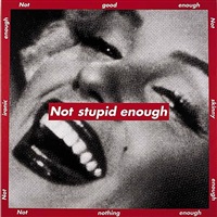
On 16/05/21 I decided to take this advice on by thinning the lines very slightly so they’re less bold contrasting and I think it frames the print much less harshly. I like the simplicity of the print, the contrasting colours and limited text/imagery in reflection has turned out to be a comparison to Barbara Kruger’s prints where she outlines the print in a line, like in Untitled (Not stupid enough) see below. The use of text and imagery of a mouth/face being the focal point is shared with Kruger’s work. Kruger’s Untitled is very confrontal relating to the way Marylin Monroe was always seen as not quite good enough for the male gaze. The use of text confirms this within her work and it’s the same for my print conveying ideas of pornography and objectification. Allowing the viewer to read and connect the visuals to form the idea I want them to have/think, just like Kruger’s ability.

Barbara Kruger, Untitled (Not stupid enough), 1997.


I printed 30 of these for the final print, see below.


I was very happy with the way the other print came out and with this idea in mind, I took to changing the other print the same way as I felt something was missing. Previously I had experimented with a yellow gradient and 3 images in pink as the yellow had always complimented the pink but it almost was too confusing as to tell what was happening in the images, see below.

Especially when on the chosen brown paper the ink turns to orange, it was hard to find the contrast/image and to define what was in the mouth. I wanted there to be a similarity between prints so I followed the same colour scheme as the print above with pink and black and removed the yellow. I liked it but felt it wasn’t right for this series of work. I created the stencil below to frame the series of 3 images see stencils below so it continues the momentum between prints, I wanted a clear distinction that they’re separate prints but to still follow the same appearance/scheme.


Printing them was very effective and now has this quality of looking like an old fashioned photo strip of film strip. Especially as the stills were taken from the film To Bite B&W Repeat it enforces this film strip quality even more. I wanted to introduce different thickness of lines to this print to match in with the variation displayed in the previous print. I think the black lines replacing the yellow background changes the perception of the pink on brown as the black lines redefines the 3 images to be recognised as separate images, you can see the breast much more clearly and almost stands out more.

NOTE: I am yet to complete the documentation of these for my blog and my portfolio.


Reflection 27/05/21: We had our final print session today where we as a group signed our prints, organised the order of them for the boxes and then boxed them up. See the process below, we lined all our prints up together to work out an order of where our work should sit together. I really enjoyed this module as I learnt a new skill within printing. We created 30 prints in total of each print in total as some are kept for sales on the uni website.

See final images of prints below which are used for my portfolio. I thought of staging them as I would for an exhibition and used bulldog clips. They feel very professional and I am really happy with them. I chose to title them in relation to my work/films so there is a continual flow from degree project to print.


0 Comments