I’ve just shown In the shadow of her gaze n.02 in S.I.T.E. at Chelsea College of Art. Each time I install this piece it changes slightly — it must because it’s assembled afresh each time working instinctively rather than to a plan. This install sees the metal rods placed close together for an intensity and level of aggression similar to the recent Shift install but with an absence of dramatic lighting. I think there is more scope to explore this potential of lighting the piece.
I spent a concentrated hour photographing the installation, and found it interesting how the piece presents regimented order from the front but a more chaotic perspective glimpsed to the side. I compromised for my lack of tripod using a chair to stabilise the camera, shooting as usual in RAW to capture as much data as possible. However, this time, on the advice of a camera-savvy expert, I keep the ISO to 100 and make better use of RAW Photoshop functionality to enhance the resulting photographs — tone curve to lighten the results, detail to sharpen the image and smooth out noise, contrast to make the image pop, and colour balance to slightly increase blue/white tones of the image. The results are a definite step forward but I can see a tripod is essential for future work to eliminate camera shake — issues are less on close-up shots but of far greater impact on wide shots — more kit to carry! However, I love the new images I’ve got that show rods and collages stretching dramatically across the picture plane. I think a mix of distance and detail shots produces a sense of the piece that better reflects how it appears in reality, improving on my previous documentation. Handy because I’ve been short-listed for Future Map 13 so need some good images for my final application!
Links:
http://clairemanning.co.uk/z_in_the%20_shadow_inst…
http://blogs.arts.ac.uk/camberwell/2013/12/12/site…
http://makingart-work.co.uk/shift-exhibition-shots…
http://futuremap.arts.ac.uk/
The next two attempts at ‘object abused’ collages:
Unfortunately, TO PATCH failed abysmally — depressingly — resulting in something than looks like a poor high-school project! It’s made of random small tears and I fear it generates something that is too busy, too distracting, and too unconsolidated with its base.
TO ERODE also proved frustrating. My initial approach was to build up to tear down, to scrunch, to worry until paper feels as soft as fabric — torn edges, finger-nail or blade eroded surfaces. This approach sounds fine on paper and I’ve managed to get it to work on one small maquette. However, the larger-scale test failed, perhaps because it became too overworked, and too detached from a process of making instinctively.
I use a tactic I’ve tried with success before – I walk away from the obsession to resolve the problem of making the piece work and spend a day with friends and new acquaintances looking at and talking about art.
The next attempt starts with preparing layers of paper, tearing them vertically into sections and overlaying them onto each other. As I do this, I realise something unexpectedly interesting is happening. Not an eroded image, but an accretion somewhat akin to the contour marks on a map, reminiscent of built up layers in Alison Lambert’s work. Once again, the simple, unfussy approach comes through! [To accrete: growth by accumulation or coalescence.] I make two small versions of TO ACCRETE, the first mounted on fabric and the second on a fixed surface. It’s difficult to decide which to make full-scale and it’s hard to portray the differences in a picture, but photographing them and seeing them from a different angle draws me to the informality and soft tactility of the fabric-mounted version.
CLOSING THOUGHTS – I realise the risk with the larger object abuse collages is their heart — the direction the materials should evolve in – is difficult to discover in larger scale, trapping me to repeat gestures and actions that have worked in the past but which fail in the now instant of making. I suppose the lesson here is that the purpose of the larger canvas is to allow something different to take place but, for this to happen, I have to remain open, instinctive and playful within the making process.
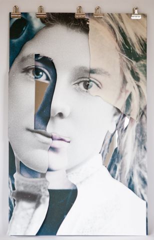
So far, I’ve tried making three versions of the object abuse collages, with somewhat mixed results. Here’s the first of them – TO SLICE – which feels like one of those instant successes that happen so infrequently — simple, strong, effective.
Random cuts didn’t work for me, but shifting to an approach where the cut removed specific areas such as dark shade or strands of hair was far more successful. In this instant it seems to me the slice operates more in the nature of a drawn line to delineate and edit.
Image choice seems vital. The approach didn’t work on another image pairing I tried but this one seems ideal as both the coloured and black and white images have sufficient details to trigger the cuts.
What remains doesn’t need to be fixed down and in the example shown here I’ve clipped it to a mirrored surface. Although this isn’t easy to capture in a photograph, this allows the paper layers to move slightly, giving them 3-dimensionality.
Use of clips allows / encourages re-arrangement and also confers the risk things may fall apart — something that fits well with the conceptual thinking behind the work. The clips work well but I might test alternative models — stainless steel bull-dog clips or the more steamlined Rapesco Supaclip system.
Use of the mirror as a support surface allows reflection to subtly pull both viewer and surroundings into the image, creating an ever-shifting reality.


